Hot Time, Summer in the City! Nursery Rhyme Progressives
While doing extensive research for the Rebus Quotes project (still ongoing), of course I came across many nursery rhymes. Initially avoiding them as too obvious a place to start the overall project, I recently decided to embrace them, and print a series of five of my favorites, presented here in what I am calling a “progressive” state. That is to say, to show how each print was built. I quickly photographed each stage of the print, from beginning to end.
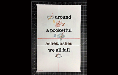
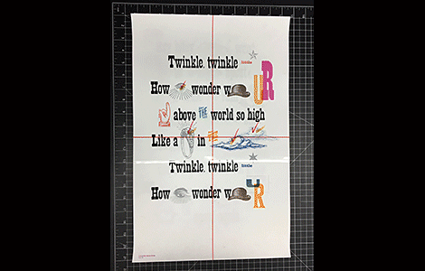
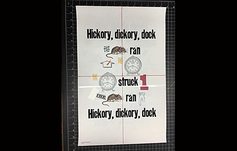
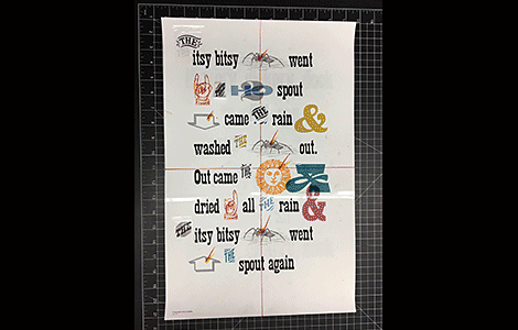
Without knowing exactly why—and perhaps intuitively—in terms of where to start to build a print—and since most of the wording on my prints have printed in black (it’s actually Cool Gray 11, just slightly different than black, but I digress…), I have almost always started by printing the black color first. With reference to the nursery rhymes (and I posted this before), just because a given color is represented does not at all mean that that represents just one time through the press. For instance, the black color of the “Hickory, dickory dock” print needed to be printed seven times, as I needed seven “k’s” to spell out the full nursery rhyme and I only had one “k” in that particular typeface.
What I didn’t know was that this way of working—printing the black color first—was apparently a common practice amongst printers “back in the day.”
After working in the Graphic Design profession for 30+ years, I have oftentimes wondered why black is referred to as “k” in four-color process printing (cmyk = cyan, magenta, yellow, black). It was during the Type and Printing Quiz at the 2017 Hamilton Wayzgoose that I finally found out. The “k” in cmyk stands for “key” as in “key color.” Which weirdly made sense. Way back in the day before offset lithography was as prevalent as it is today, and before the printing equipment became as sophisticated as it is today, very often in printed publications the majority (hence the term “key”) of the text color was black.
So, now I get it! And as I mentioned above, I have been intuitively working this way for a while. I usually print the black—or key color—and then I tend to print the other more neutral colors like silver (which I consider to be like a gray) and brown. Then followed by whatever other bright colors are needed for the particular prints.
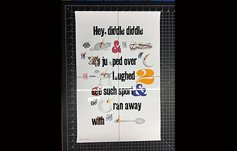
All this to say, now you can see just how these nursery rhyme prints were made. With many, many, many passes through the press. Enjoy!